Color Palette offers a variety of color selections and makes color matching more accessible and playful for designers.
Color Palette
Tuntex presents an 8-color palette comprising the most common colorways used in flooring design.
Infinity Colors in Nature
The colors found in nature have an infinite power to evoke emotions. Tuntex draws inspiration from Mother Nature's vast and diverse color palette to offer a wide range of colors rich in natural elements that can be used to create beautiful and unique designs.
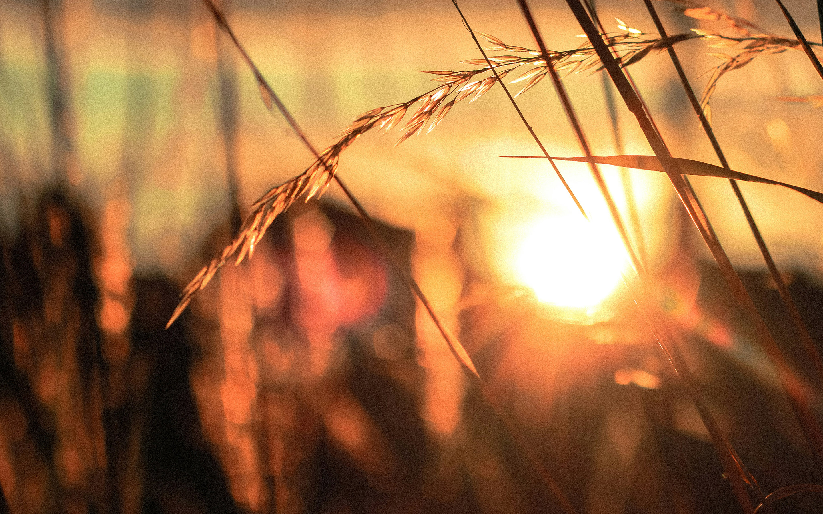
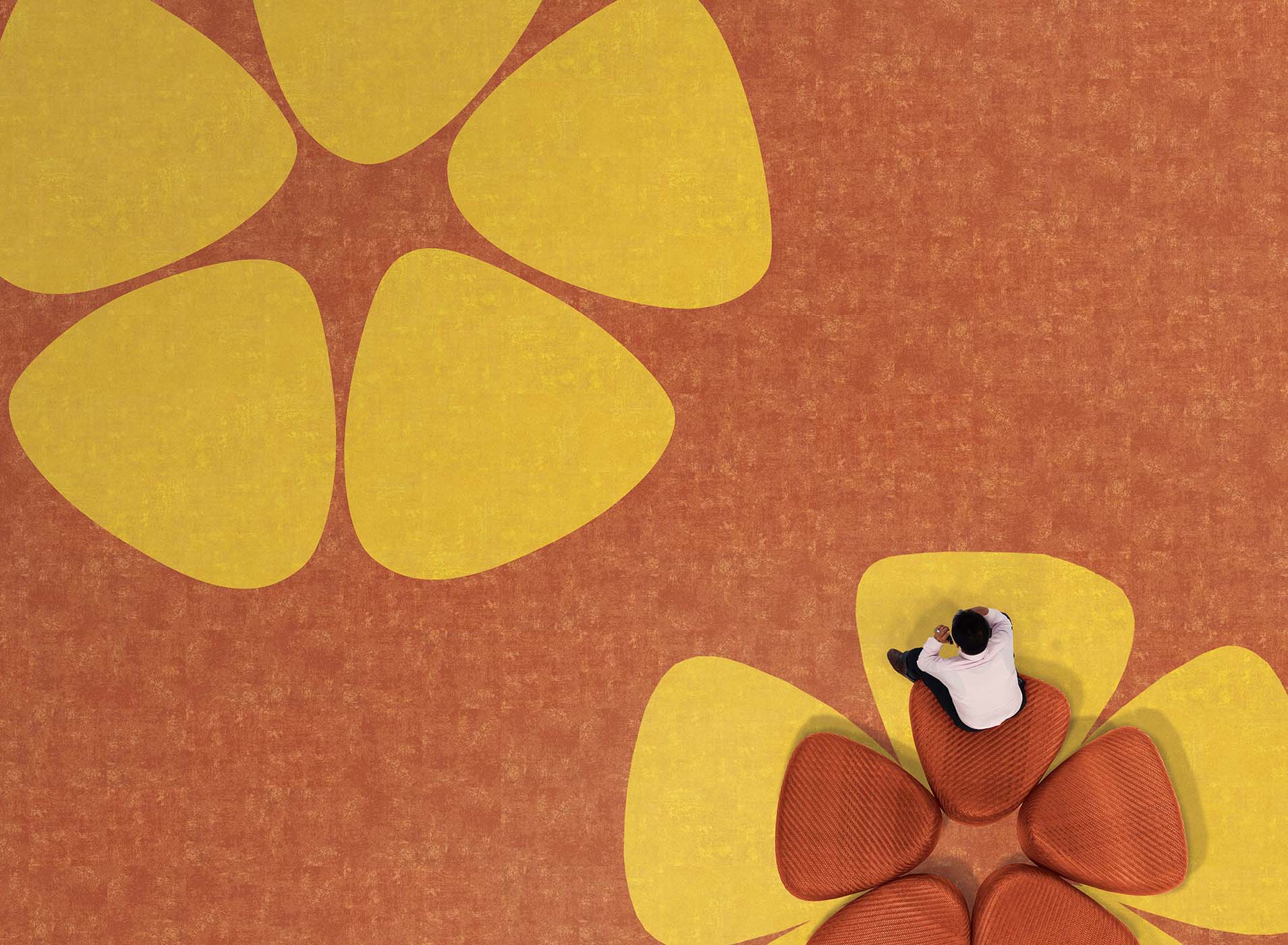
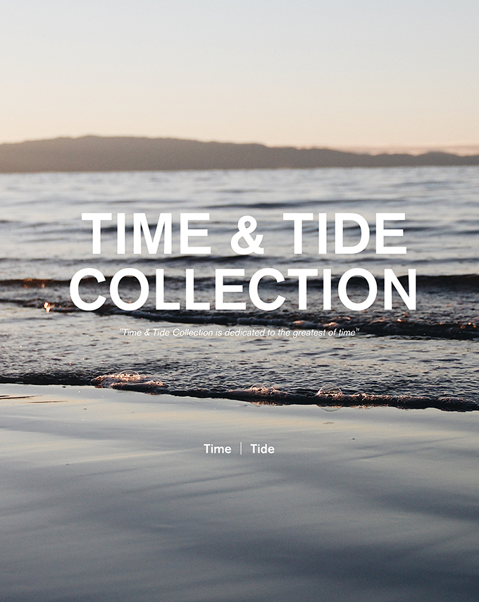
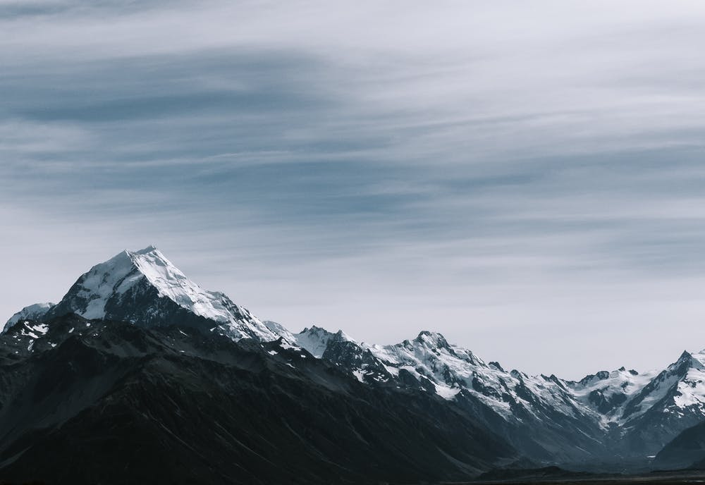
Sun
Sun is a series of deep and vibrant colors that resemble the color of cherries, rubies and tangerines. It represents enthusiasm and liveliness and is suitable for those who are looking for a colorful space that gives warmth and makes people feel energetic.

Forest
Forest is the way to go because green reminds everyone of the earth. Different shades of green are harmonious when paired together. This color is often used in lounge areas and entranceways, making the occupants feel refreshed and relaxed.

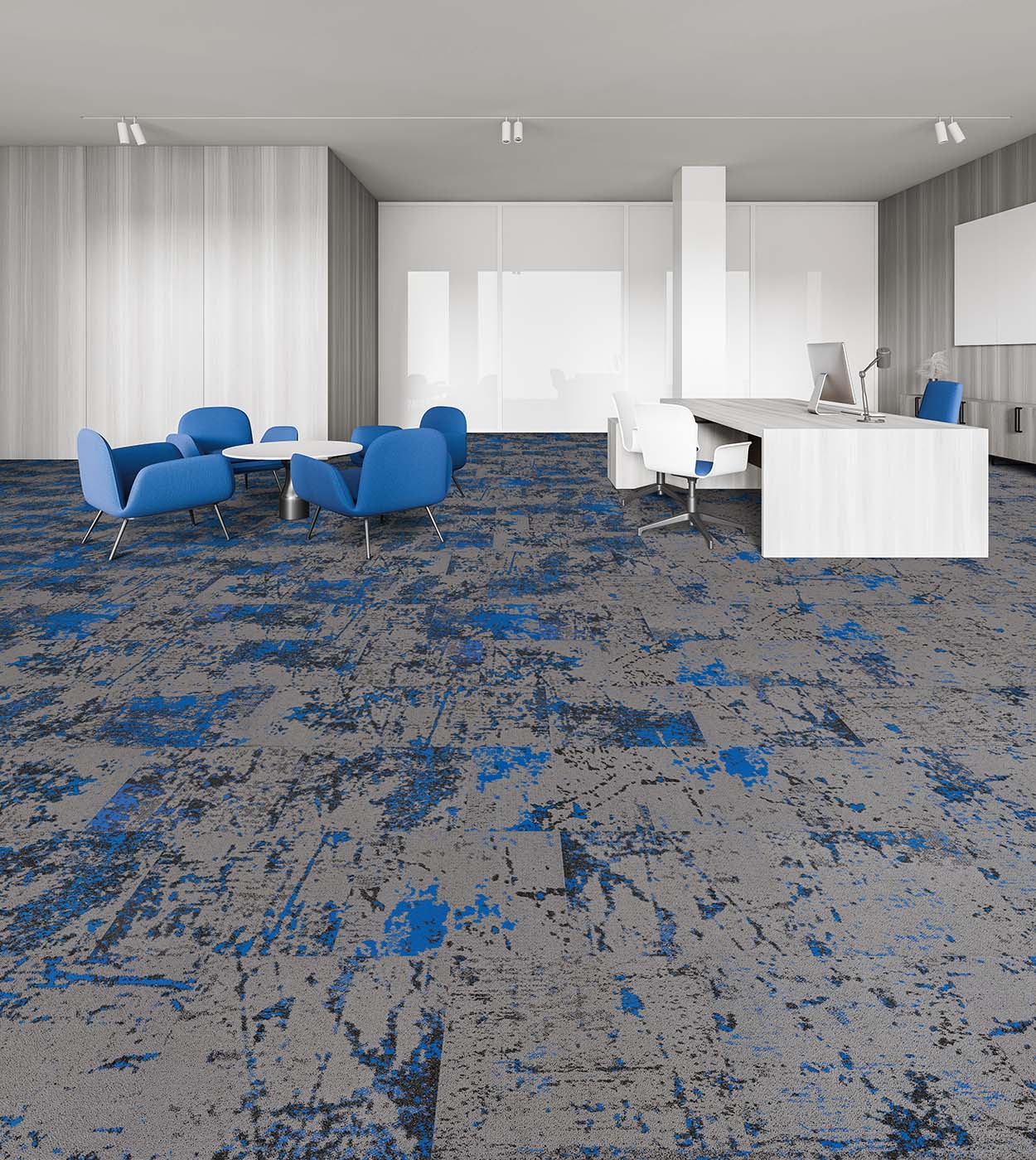
Ocean
Ocean blue is often associated with peace, beauty, and clarity. The saturated shade of blue that makes everyone feel calm, refreshed, and soothed. This cool hue is often chosen for places that are designed to create a realm of tranquility and solitude when people want to rest.
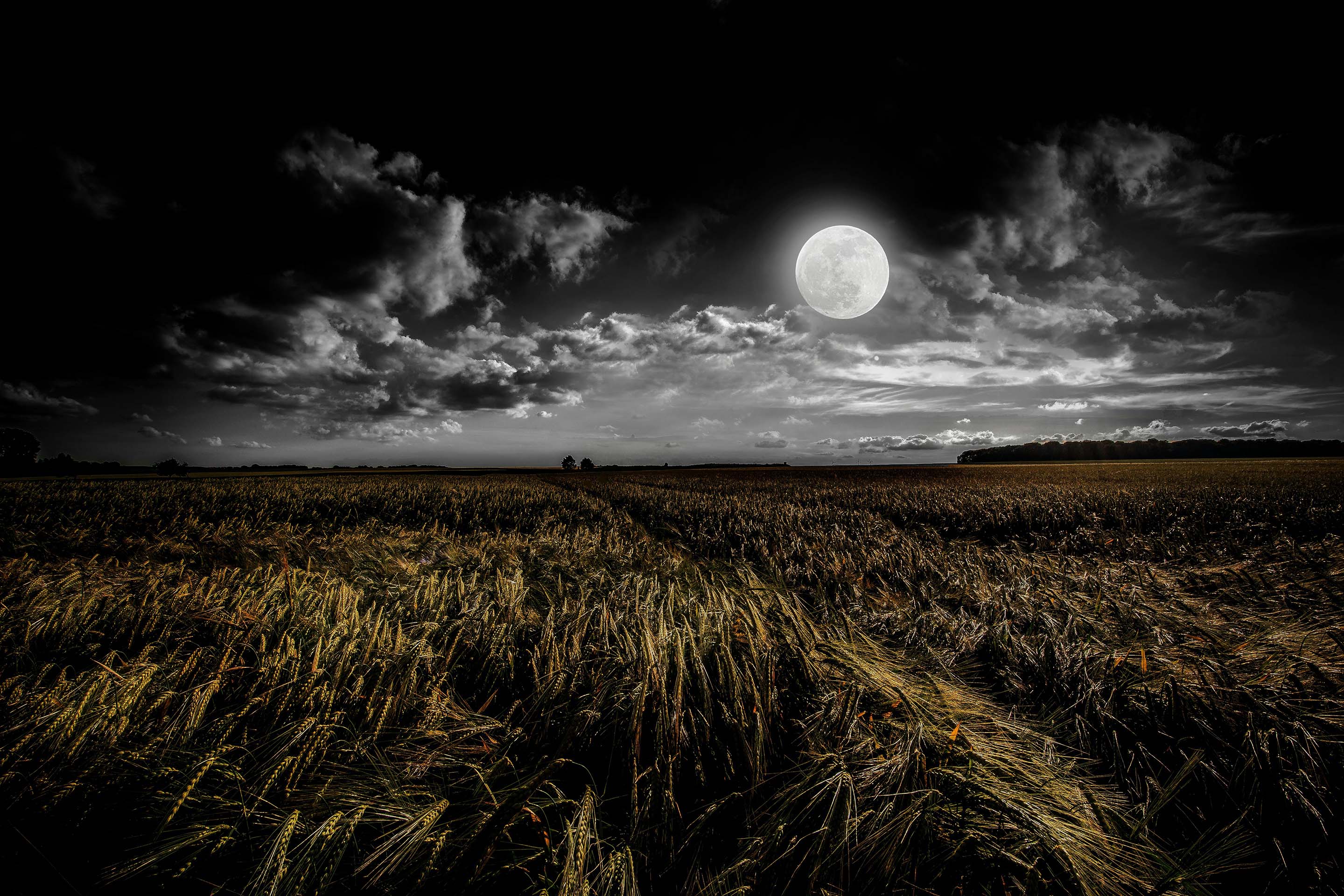
Moon
Moon conveys a sense of calm and peace. This set of grays not only matches well with each other, but also with other highlight colors, allowing the freedom to create a darker aura while keeping the design varied.
Cloud
Cloud includes one of the best-selling base color themes for flooring designs. Lighter greys are airy and timeless. They are versatile and can be used in a variety of spaces from corner offices to hospitals to university campuses.
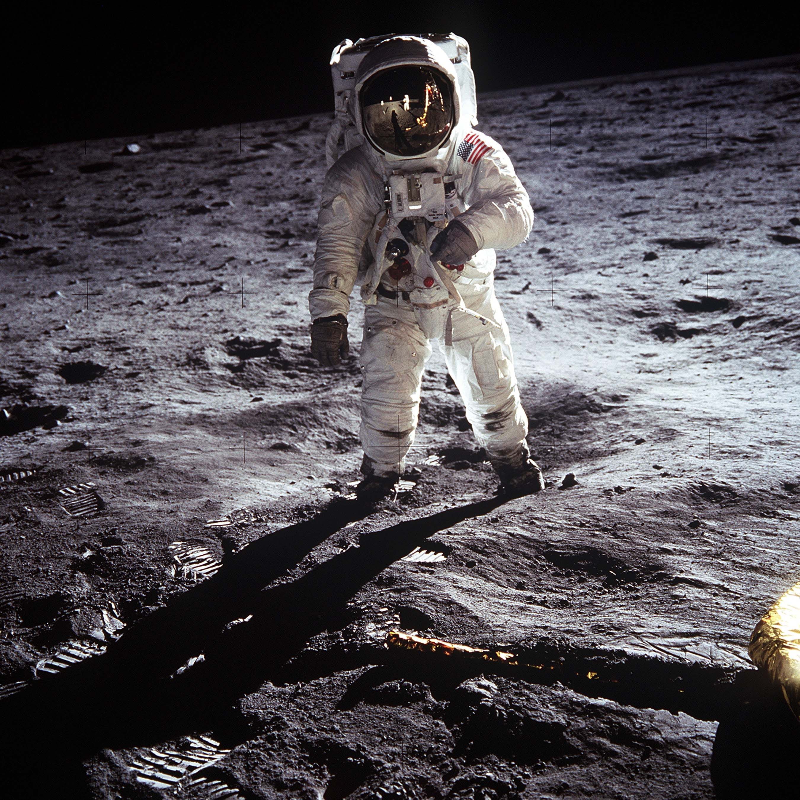
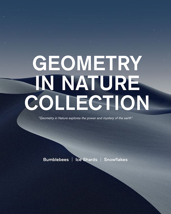
Universe
Universe conveys a sense of mystery and strength, as does a dark, charcoal-like grey. Designs with darker colors are often simpler and more formal, yet sophisticated, without the negativity of black. At the same time, it's a useful color for creating strong contrasts with bright colors such as metallic, gold, red, and yellow.

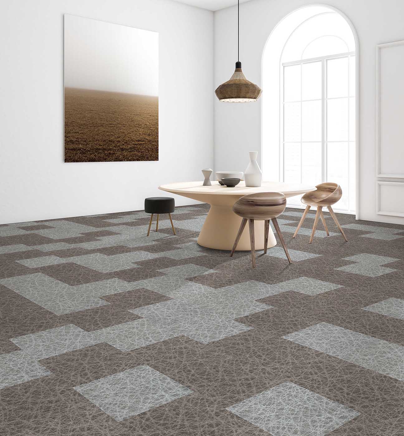
Beachfront
Beachfront transforms the soothing feeling of your feet sinking into the sand and the beach sand slipping through your fingers into tangible designs. A combination of browns and greys, this color palette makes interiors feel cozy and inviting.
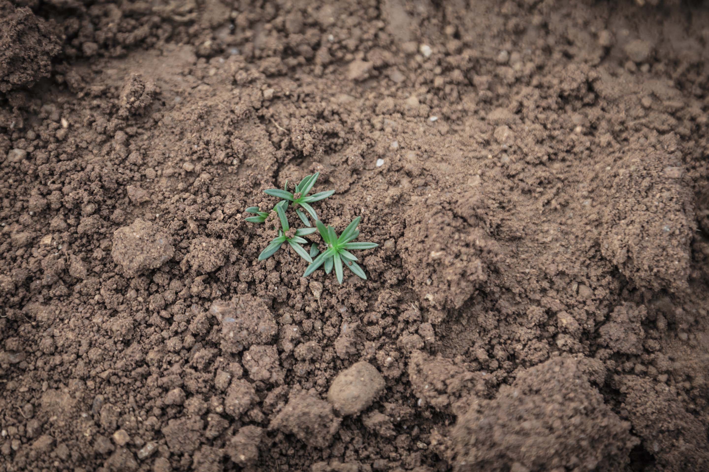
Richearth
Richearth symbolizes modesty and neutrality. With patterns that resemble various types of stones and pebbles, these warm shades of earth tones provide understated elegance with a strong sense of individuality that enhances the overall visual design of a room.
Color Tools for
Designers
Inspired by the colors of nature, the idea behind Color Palette is to offer a variety of color choices and make color pairing more accessible and playful for designers.