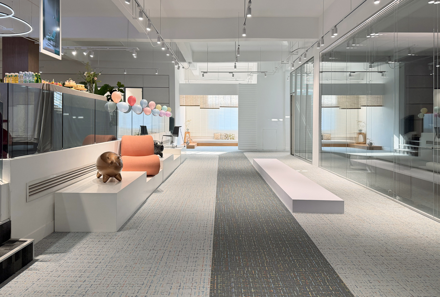
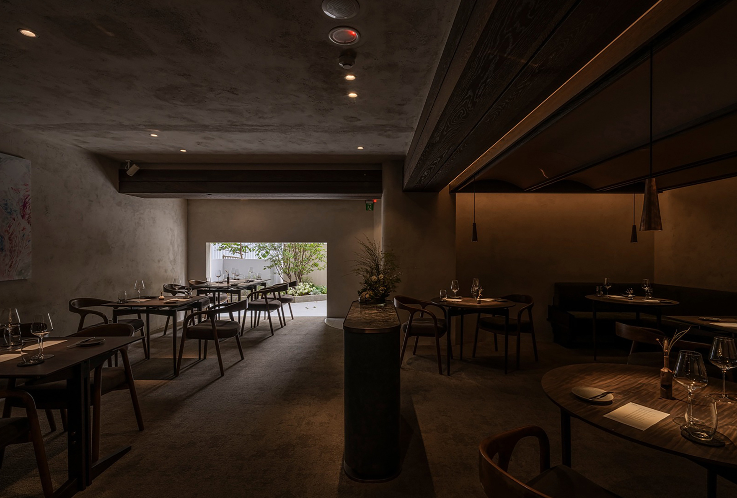
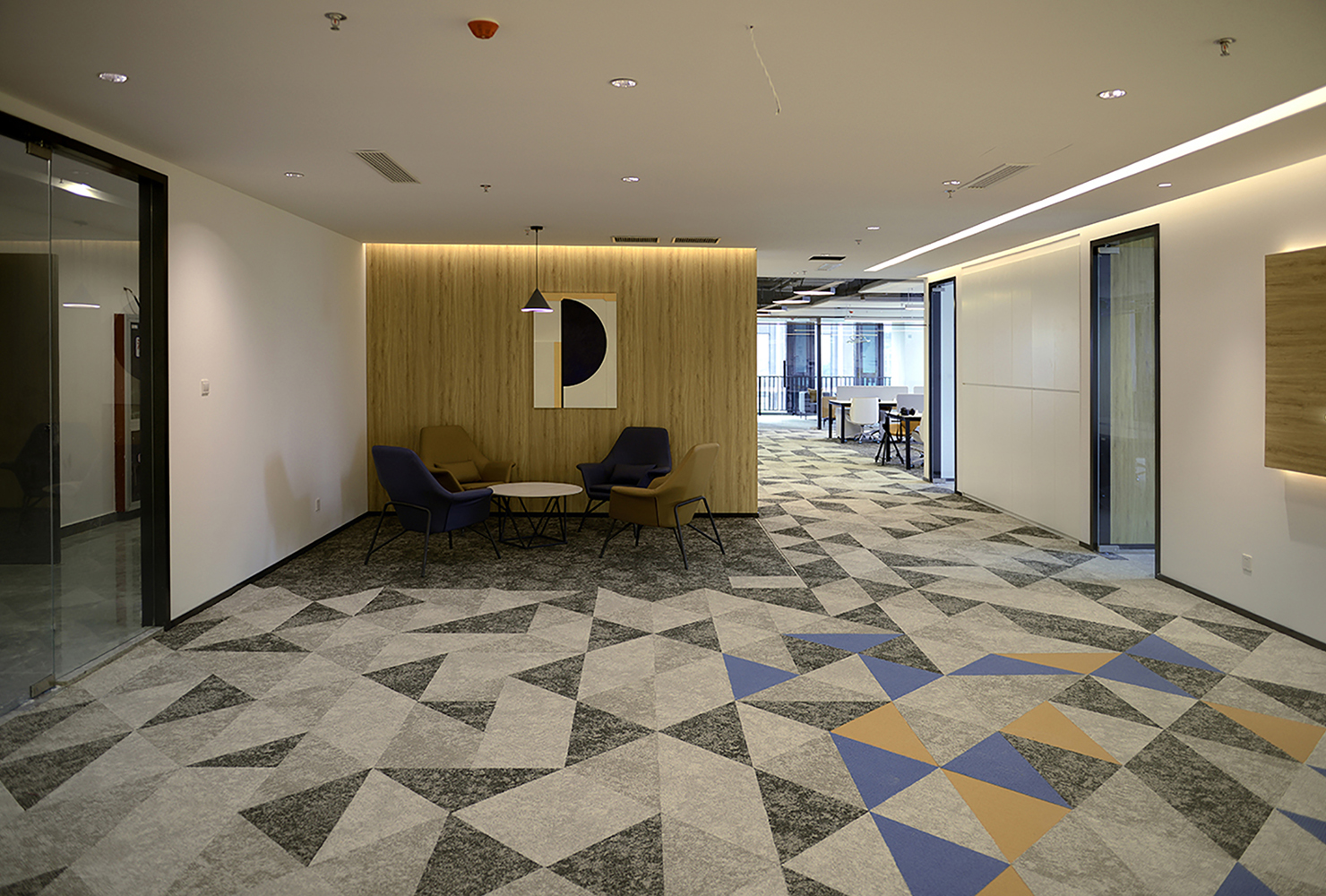
Geometric shapes such as squares, triangles, and circles, commonly found in the realm of mathematical rigor, have been widely used in modern art. These basic graphic elements, familiar to all, have the potential to create a unique aesthetic atmosphere when used by skilled designers. Tuntex has applied them to case design, combining the use of shapes and colors to create visual effects that complement the atmosphere of the space.
Circle: The Beauty of Consistent
The shape of the circle carries significant symbolism. It evokes a feeling of harmony. Its shape is often associated with the boundless sky and the shining moon. In addition, a circle has no clear beginning or end; it moves and cycles constantly, providing a sense of continuity. The circle can serve as a focal point and is a versatile graphic element in design.
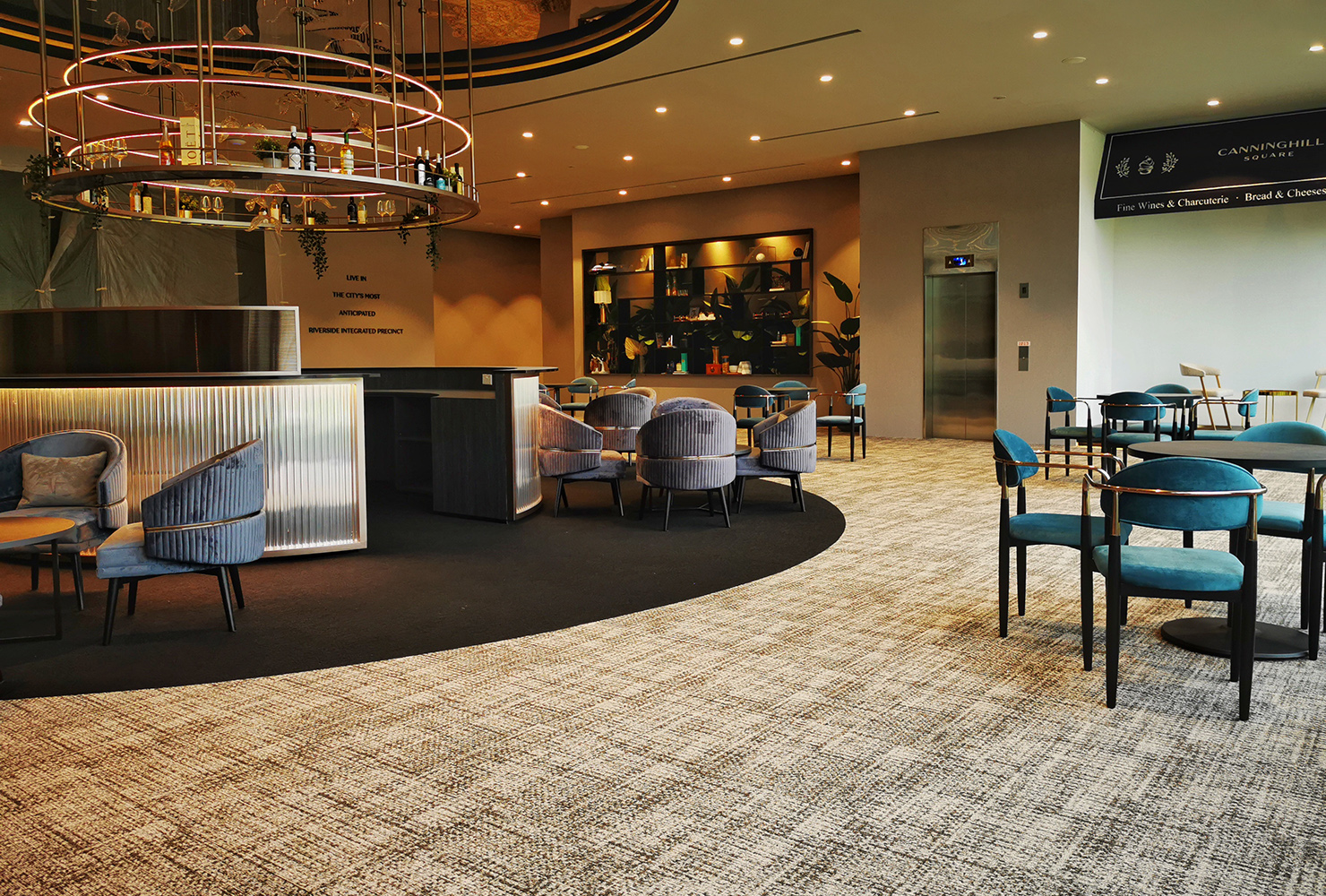
The design choice for Canninghill Piers in Singapore, a high-end business complex, was deliberately subtle. The curved lines and neutral colors effectively enhance the space's opulent ambiance.
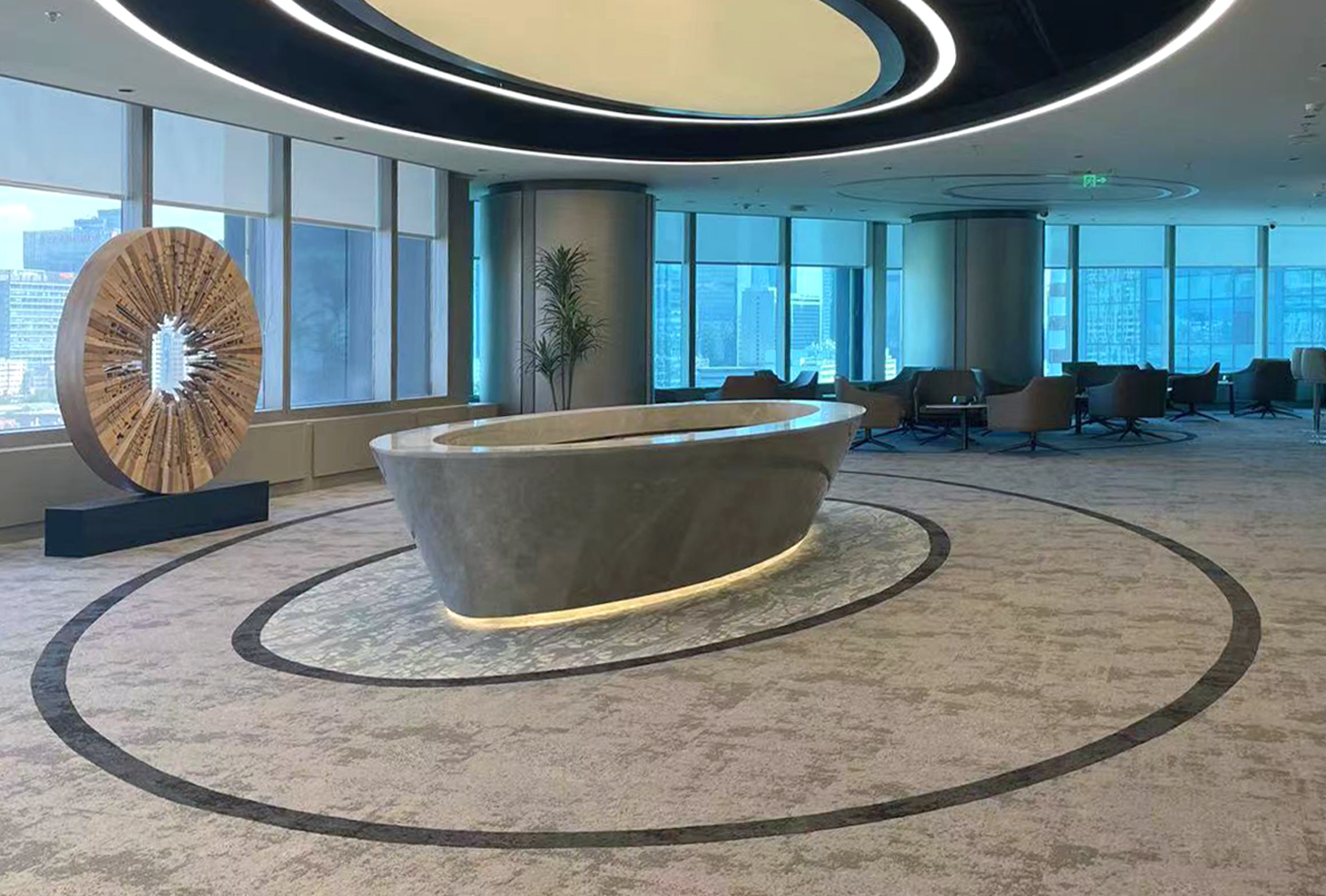
For the Exchange Twin Towers in Beijing, since it also targets the high-end market, a stylish concentric circle design was used to create a sense of elegance.
Triangle: Solid and Stable
The triangle is a stable shape, known for its angular and simple form. It has been used throughout history to create geometrically beautiful and visually striking works of architecture. From the pyramids of ancient Egypt to the Gothic churches of the Middle Ages to the Louvre in Paris, the triangle has been a symbol of classical architecture and has witnessed the evolution of architectural history.
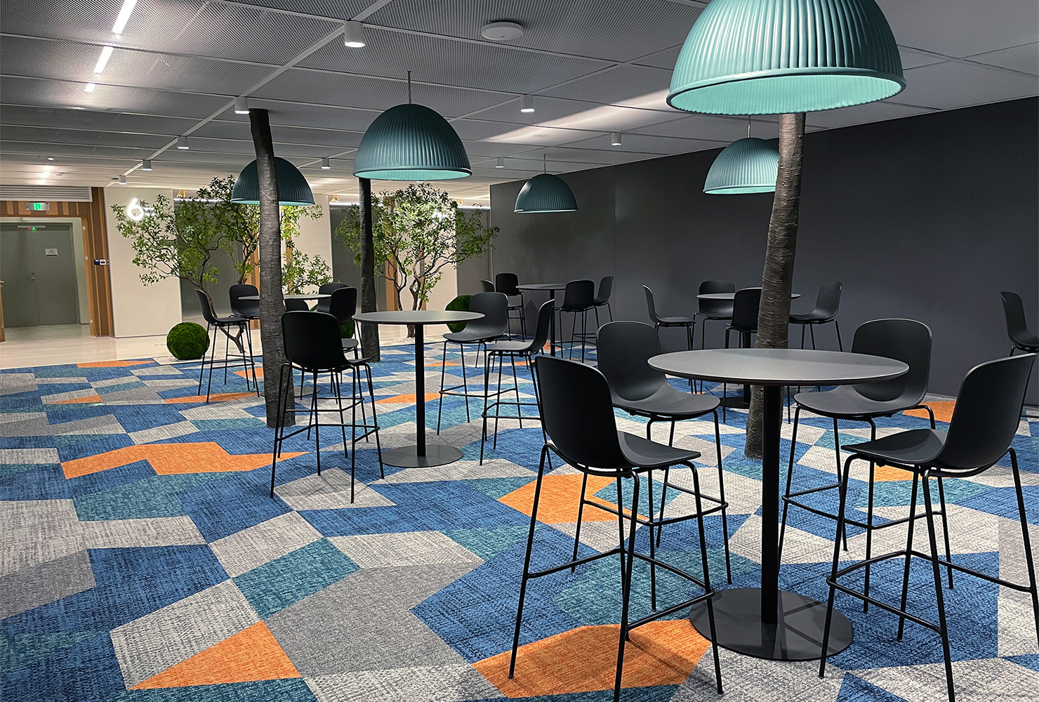
In modern design, flexible triangles have become essential elements in creating dynamic and vibrant spaces.
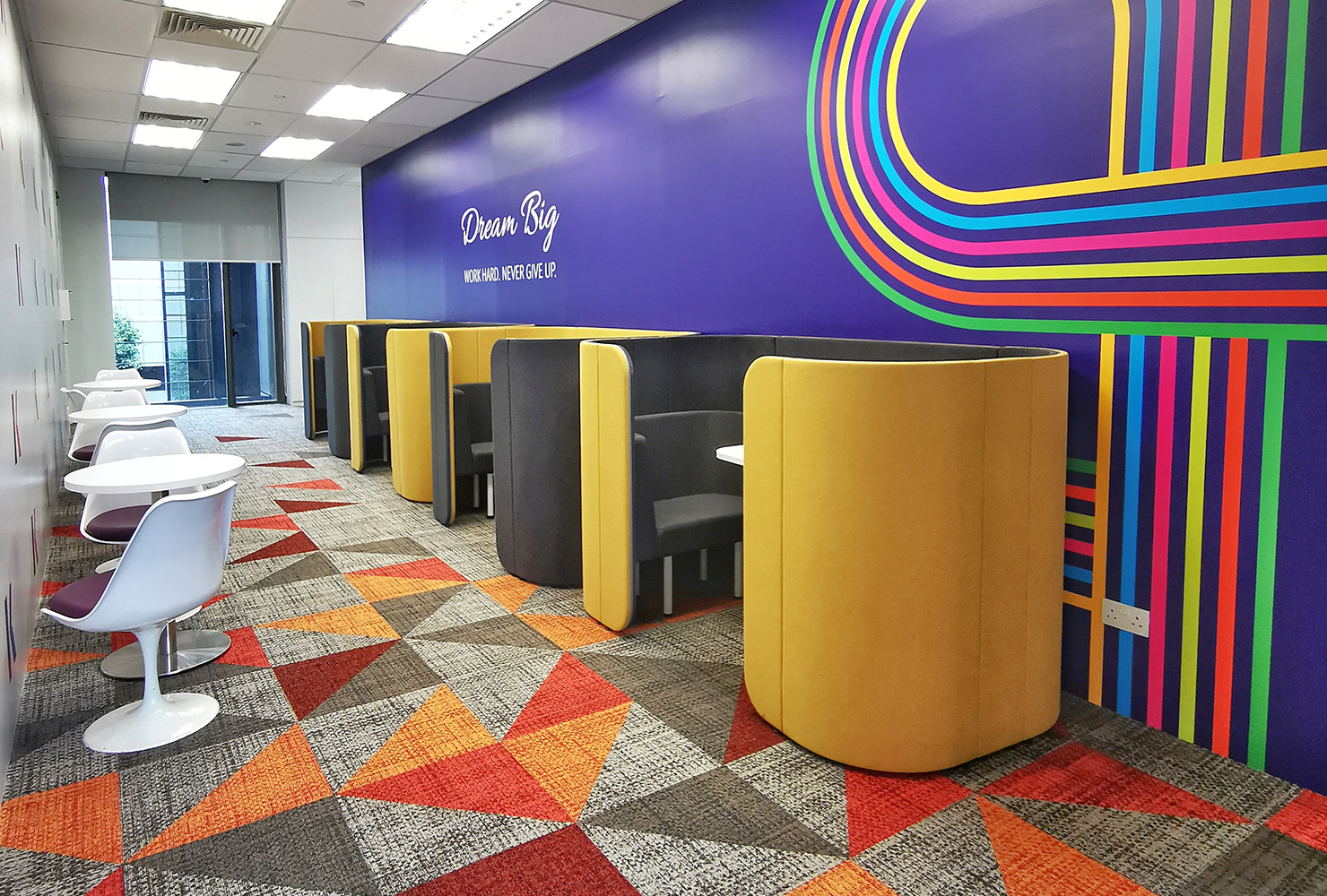
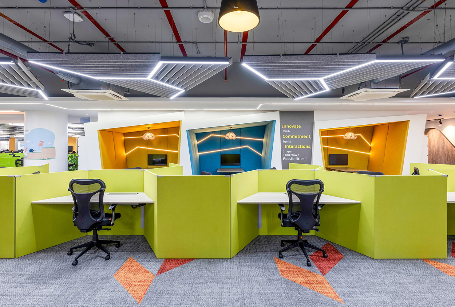
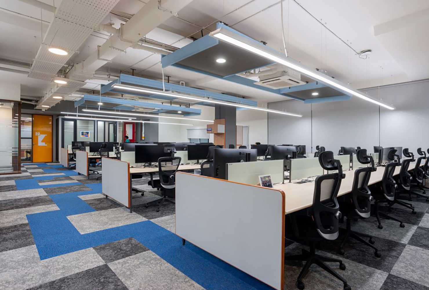
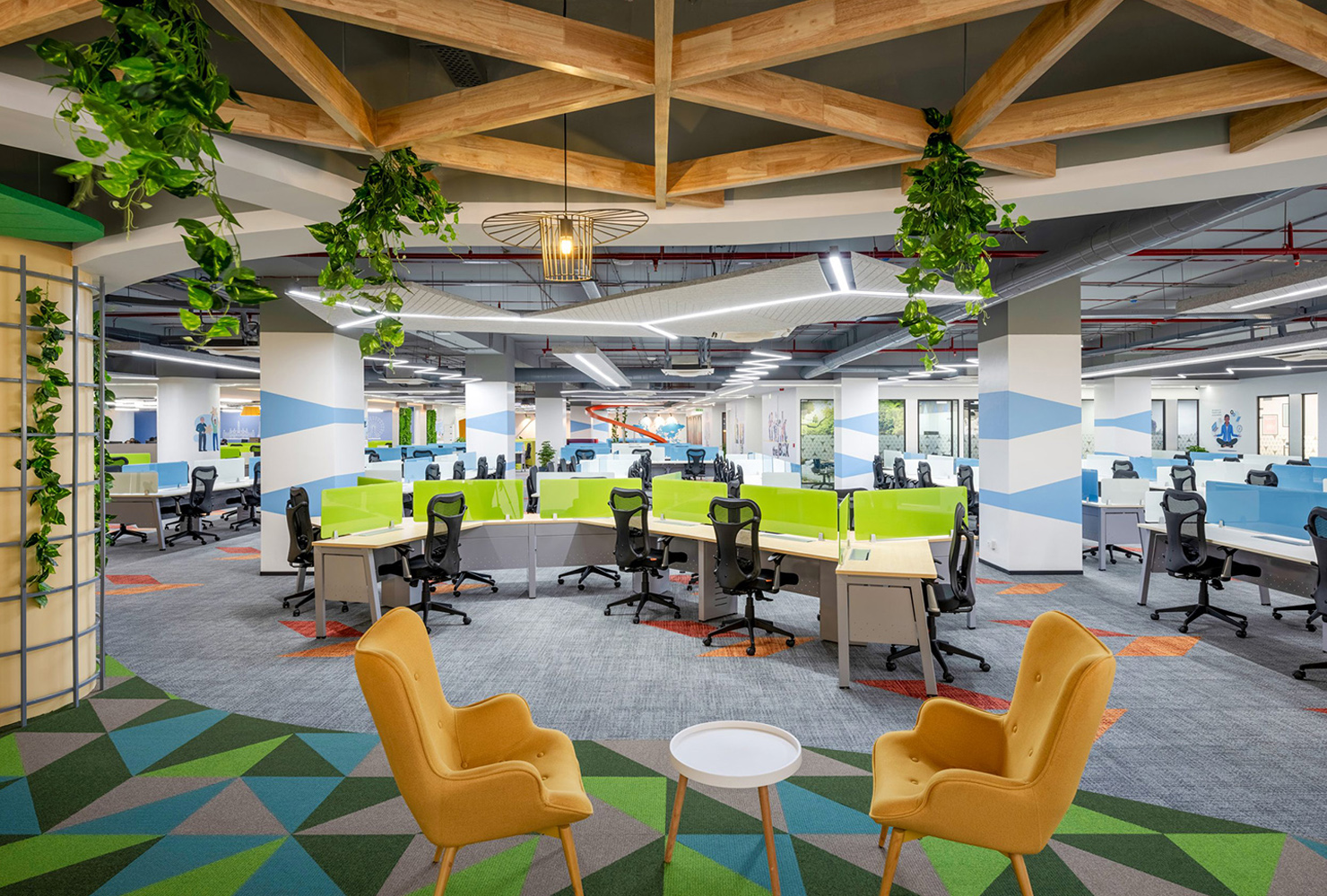
In Atlas Copco's Pune office, these innovative triangles and bold colors convey a sense of protectiveness, reliability, strength, and purposefulness, creating an inspiring environment.
Square: Classic and Inclusive
Square forms often give people a sense of integrity, regularity, and order. However, what appears to be order can easily morph into something new.
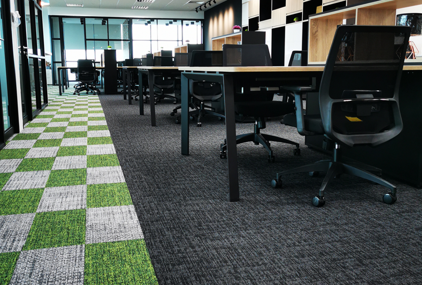
When designing the Biofourmis' office, the floor was carefully paved in a retro green and white checkerboard pattern. It became a visual focal point through contrasting color changes, while subtly adding a light and lively visual treat to the office space.
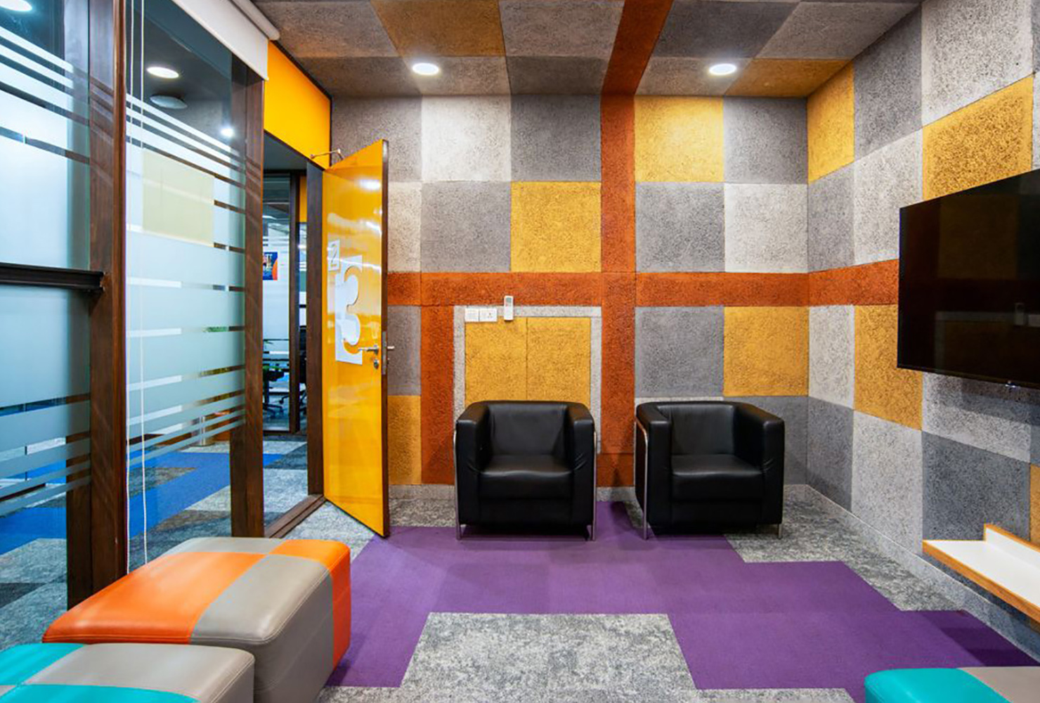
The clever use of squares aims to create a collaborative social workspace in the Evora IT Solutions office. The flexibility of the design and the careful mix of colors create an evocative, vibrant space.
In the art of interior design, even simple shapes can burst with energy with the addition of creativity and color. This simplicity and classicism are beauty that will endure even after many years.

