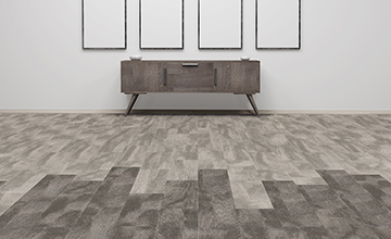
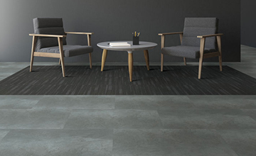
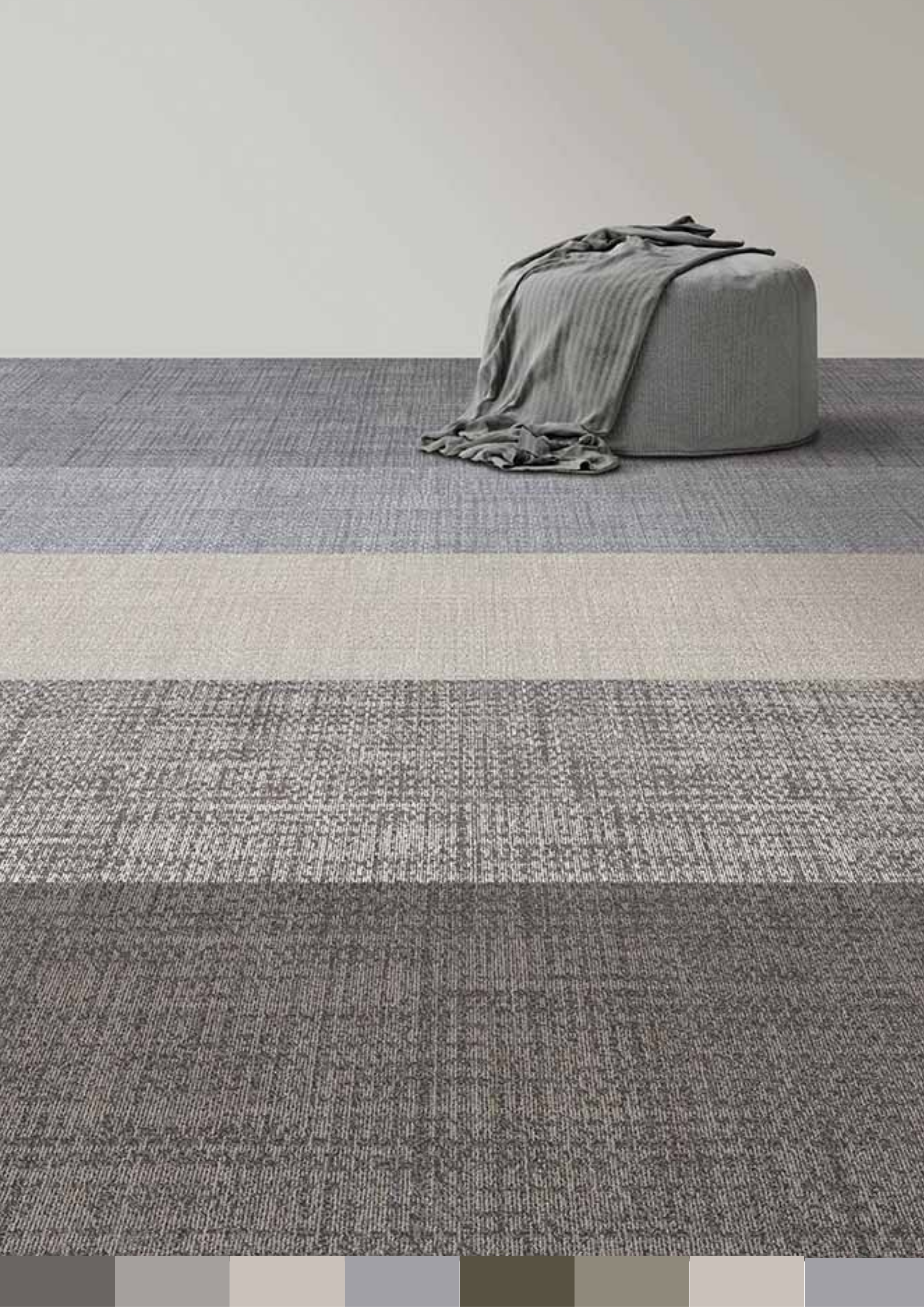
Color enriches our lives in powerful ways and influences employees’ productivity, mood, feelings, and behavior in the work environment.
For interior space, the carpet is typically the largest surface, playing a major role in both color selections and aesthetic design.

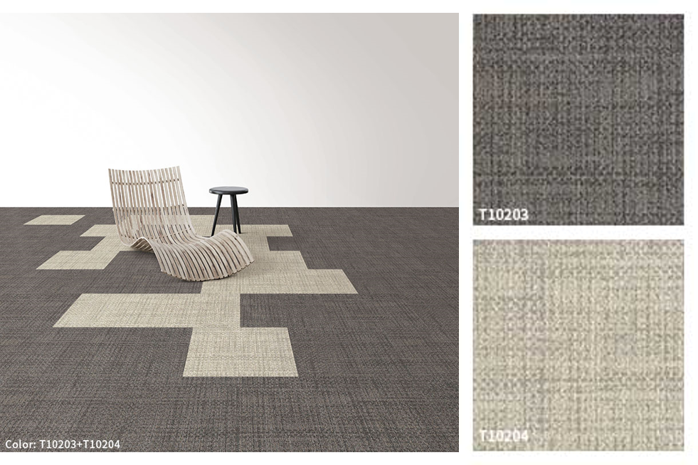
Tuntex released 18 colors of carpet tiles called 102 Linen collection. We will tell you how carpet colors can influence people in the workplace by using T102 Linen as the carpets' color selection.
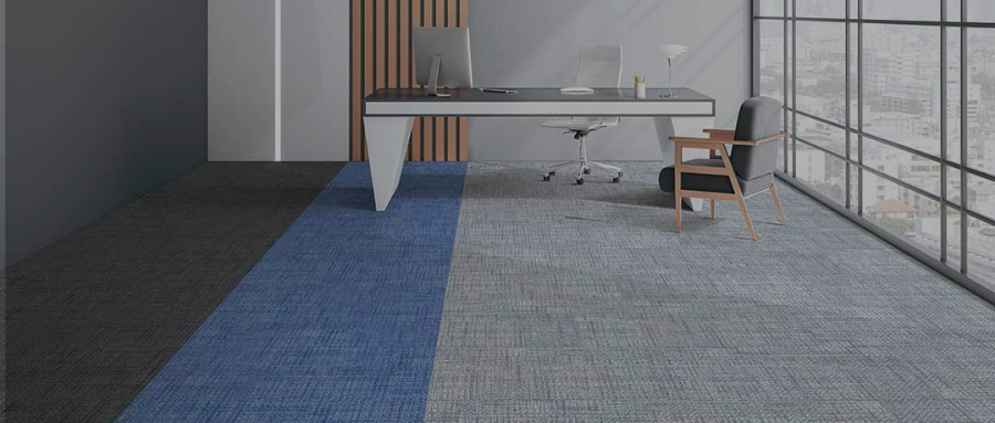
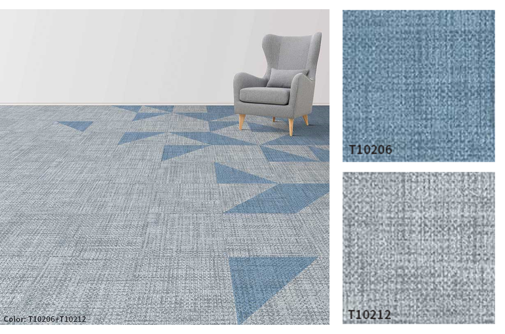
Blue - Creativity
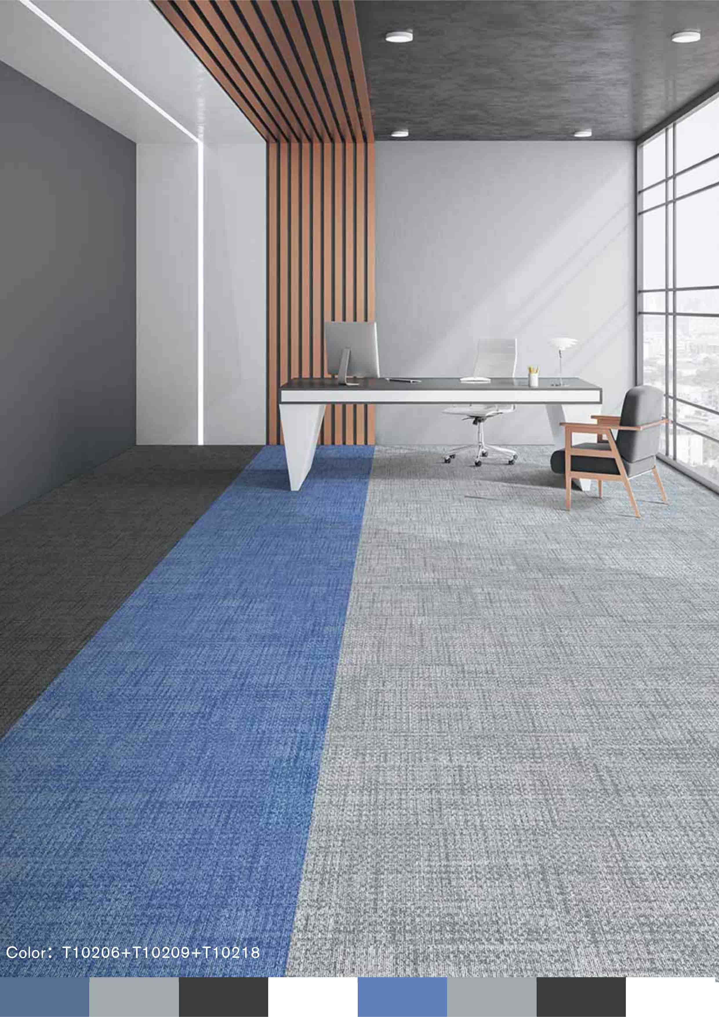
Blue is used with ocean, sky, and dreams.
Blue is one of the most creative colors for rooms where people create on a daily basis, like game designers, researchers, and other types of designers. It is also considered as the most calming color.
When Aqua Blue, Storm Grey, and Dark Charcoal are combined, they often pair naturally. Aqua Blue offers a calming, peaceful companion and completely changes the dynamic of the color combination.
Green-Relaxation
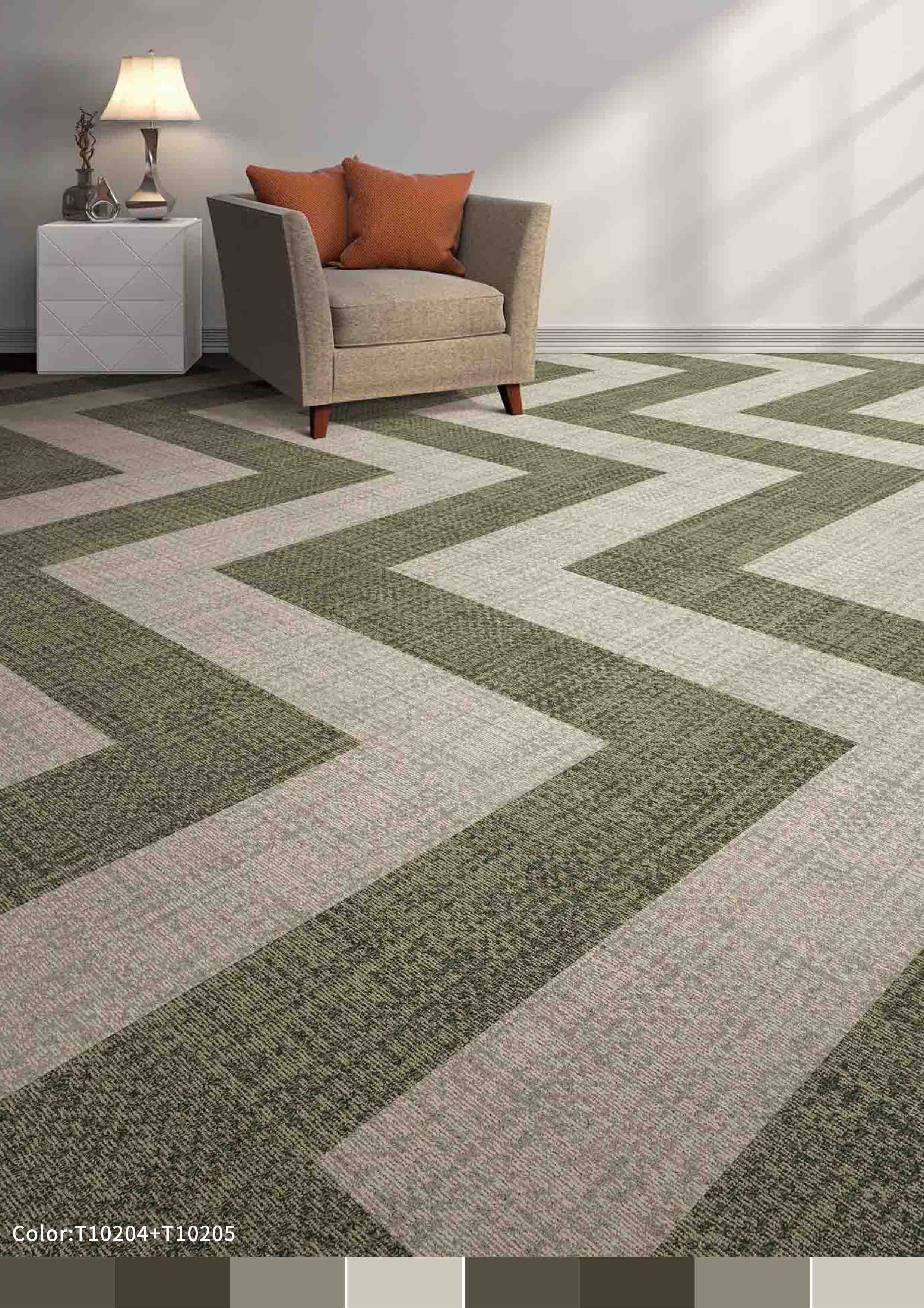
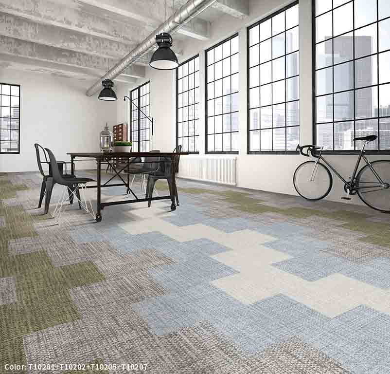
Green is strongly associated with grass, spring, and green friendly. Green helps reduce anxiety and especially makes people feel comfortable and calm. The Olive Green of T102 and Ivory White combination is clean, vivid, and highly flexible. When Olive Green is mixed with Ivory White, its positive connotations are brought to the fore. They are renewal, bringing natural and comfortable feelings into space.

Red-Passion
The heart is red, and the blood is red.
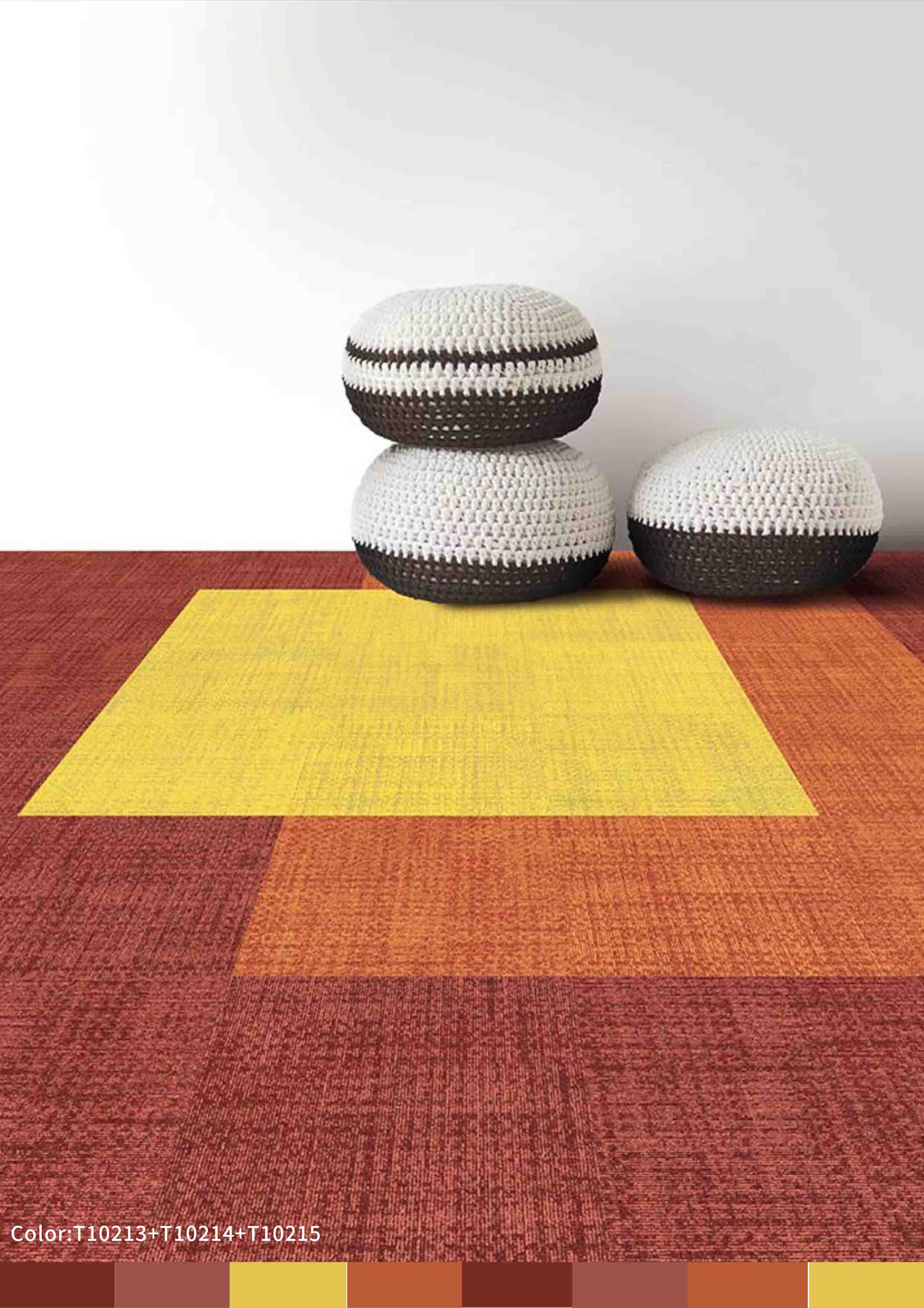
The red carpet can excite and stimulate employees by increasing heart rate, brain activity, and blood flow. If your work involves physical activity, the red carpet is your first choice. The color combo of Shiraz, Outrageous Orange, and Corn works well for a happy and warm workplace. These colors of T102 help stimulate feelings of passion and excitement and have very strong attention-getting characteristics.
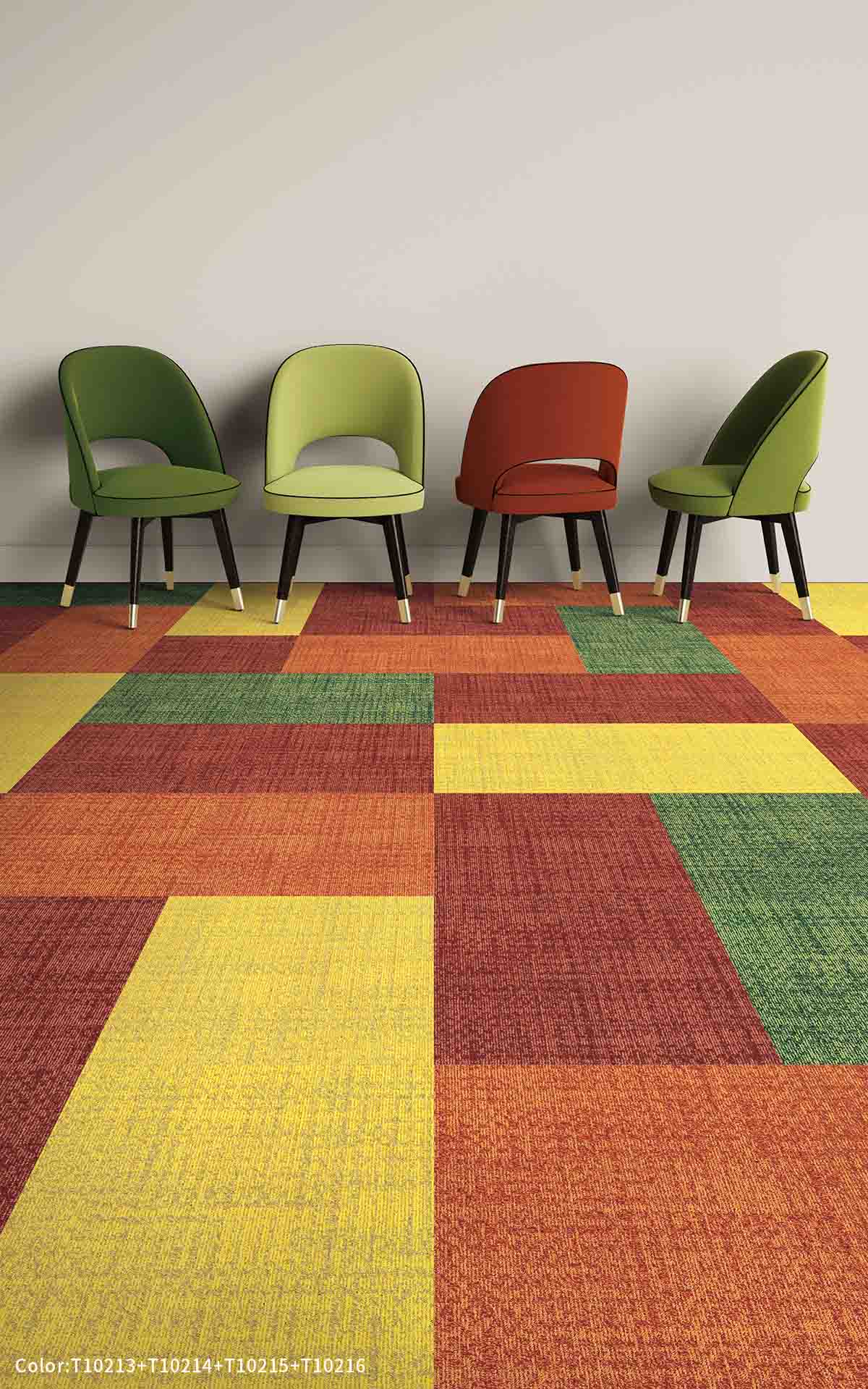

Brown-Professionalism
Brown is associated with low-key and general color. It is actually a wonderful color for steadfast professionalism and dependability. Brown is for people who work in a particular profession, especially medicine or law. The brown color of T102 is a fantastic backdrop to the Creamy, creating a delightful combination of colors that ideally suit for interior design and make your employee feel warm.
